This website was originally launched in the early 1990s, drawn in part from Dr. Max van Manen’s own work, including the text Researching Lived Experiences: Human Science for an Action Sensitive Pedagogy. Since that time, Dr. van Manen’s enthusiasm for phenomenology as a method for human science inquiry has continued.
- Structured Information Architecture: The website organizes a vast amount of academic content on phenomenology in a structured manner. Sections for topics like “methodological ideas” and “research methods” ensure easy navigation, allowing users to explore complex content with minimal friction.
- Responsive Design: The website adapts well across devices, ensuring that users on mobile, tablet, and desktop have a smooth browsing experience. This is essential for academic audiences who may access the site from various platforms.
- Custom CMS for Complex Content: It likely uses a content management system (CMS) customized to handle the large body of text and different sections on phenomenology. The design supports ongoing updates of academic texts, making it easy to add or adjust content.
- Efficient Search Functionality: Given the depth of content, the search functionality is critical to helping users quickly find specific information. The search tool efficiently indexes the content, helping users locate the resources they need without manually navigating through layers of text.
- Multimedia Integration: The website integrates images and other media, adding visual aids to dense academic material. This breaks up long passages and helps users better understand the concepts being discussed.
- Accessibility: The website appears to follow accessibility best practices, ensuring that all users, including those with disabilities, can access and engage with the academic material. Proper heading structure and contrast are applied in many sections.
The most exciting part of this work was the taxonomy visualization. The visualization employs a layout to represent taxonomic relationships: 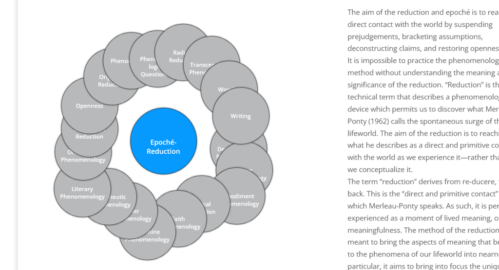
- Central Parent Node: The primary concept occupies the center, visually emphasized with a distinct color (blue).
- Orbital Child Nodes: Related sub-concepts or child terms orbit the central node in a circular arrangement, each represented by a smaller, uniformly styled circle.
- Proximity-Based Relationships: The proximity of child nodes to the central parent node implicitly conveys their relationship, eliminating the need for explicit connectors or hierarchical levels.
- Equal Emphasis on Children: All child nodes are equidistant from the parent and styled identically, suggesting equal importance within the taxonomy.
- Scalability: This layout can accommodate varying numbers of child nodes by adjusting the orbit radius or introducing multiple orbits for larger taxonomies.
- Interactive Exploration: Each node likely serves as an interactive element, allowing users to navigate to more detailed information about each concept.
This approach effectively communicates taxonomic relationships while maintaining a clean, uncluttered aesthetic. It encourages non-linear exploration of the taxonomy, making it particularly suitable for educational or reference materials where users may want to browse related concepts freely.
