Category: Design

  • Setting Up A Custom Color Scheme For Divi

    Setting Up A Custom Color Scheme For Divi

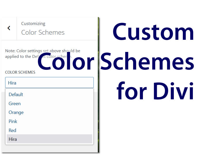
    I have attached the file that I used my case.One Divi feature is”Color Scheme.” It presets for green, orange, pink, red and its default blue color schemes that influence the colors of borders, buttons and other accents on a baseline Divi theme. What happens if none of those colors jibe with your design? In our case, there were layers of styling rules: baseline WordPress, Divi, Woocommerce, and our styling. It’s great that Divi has Woo specific styling available, but it wasn’t helping what we were trying to accomplish.  That’s a lot to wade through and all of those style rendering decisions turn into processor use on your client machines. A site that is intensive to render may perform worse or appear to render in some unpredictable way on some browser. Rather than add to that, setting the color scheme in Divi is one way to output as little styling as possible. The following is my approach for overriding the Divi color schemes and adding a reference for your project.

    The Divi color schemes can be appended by adding some filters and actions to your custom theme’s functions.php

    In my case, I was working on a custom theme, named “hira,” so the prefixes in my example echo that.

    The color scheme choices need to be appended.


    // Add Hira color scheme to Divi color scheme choices
    function hira_color_scheme_choices($color_choices = []) {
    $color_choices['hira'] = esc_html__( 'Hira', 'Divi' );
    return $color_choices;
    }
    add_filter('et_divi_color_scheme_choices', 'hira_color_scheme_choices');

    The color schemes need to be appended with an entry for the new key (example here: ‘hira.’)


    // Define the Hira custom color scheme
    function hira_custom_color_scheme($color_schemes) {
    $color_schemes['hira'] = array(
    'Accent Color'         => '#FF5733',
    'Secondary Color'      => '#33FF57',
    'Footer Background Color'  => '#3357FF',
    'Menu Background Color' => '#FF33F1',
    'Menu Text Color'      => '#33FFF1',
    );
    return $color_schemes;
    }
    add_filter('et_builder_color_schemes', 'hira_custom_color_scheme');

    After the color scheme is set, it can be referenced. In my case, I added a css sub-directory to my child theme, “css.” I made a stylesheet for this scheme. I called it “hira_scheme.css” and put it in that css file.


    // Load the CSS only if Hira color scheme is selected
    function load_hira_scheme_css() {
    // Get current theme options
    $settings = get_option('et_divi');

    /* Check if 'hira' is selected as the color scheme */
    
    if ( isset( $settings['color_schemes'] ) && $settings['color_schemes'] === 'hira' ) {
    // Enqueue the Hira color scheme CSS file
    wp_enqueue_style( 'hira-scheme', get_stylesheet_directory_uri() . '/css/hira_scheme.css', array(), null );
    }
    }
    add_action( 'wp_enqueue_scripts', 'load_hira_scheme_css', 15 );

    To build out the scheme elements, I cribbed from the main divi file,
    /wp-content/themes/Divi/style-static.min.css
    I looked for all of the color scheme relevant stylings with the “_scheme_red” phrase in the selectors and copy them into my [keyword]_scheme.css file. I then do a find-replace to swap
    “_red” to match your phrase from your color scheme settings (in my example, I would be swapping _red or _hira

    I have attached the file that I used my project.


  • 9 Trends & Flexes In 2024 Web Design

    9 Trends & Flexes In 2024 Web Design

    In 2024, the landscape of web design continues to evolve, embracing new technologies and design philosophies that enhance user experience, accessibility, and visual appeal. Here’s an updated take on the key trends mentioned in your article, reflecting the latest developments and best practices in web design.  We put a lot of effort into assembling a list of advents that website owners could consider adding to their web projects to take their design to the next level.

    1. AI-Driven Personalization

    Artificial Intelligence (AI) has become deeply integrated into personalizing user experiences across various digital platforms. Websites and applications now leverage advanced AI algorithms to dynamically adapt content, layout, and recommendations in real-time based on user behavior, preferences, and contextual data. This tailored experience extends beyond just websites, as AI-powered personalization is now prevalent in virtual and augmented reality environments, smart home assistants, and even interactive advertising displays.

    One notable development is the rise of generative AI, which can create personalized content, such as articles, images, and even videos, tailored to individual users’ interests and preferences. This technology is being utilized by content platforms, e-commerce sites, and social media networks to provide a highly customized and engaging experience for each user.

    Furthermore, AI-driven personalization has become a crucial component of optimizing user experiences in fields like healthcare, education, and customer service. Intelligent systems can analyze individual needs and adapt interfaces, content delivery, and even treatment or learning plans accordingly, leading to more effective and efficient outcomes.

    As AI capabilities continue to advance, the level of personalization is expected to become even more granular and dynamic, with systems capable of anticipating user needs and preferences before they are explicitly expressed. However, concerns around privacy, data ethics, and potential biases in AI systems remain ongoing discussions as this technology becomes more deeply integrated into our daily digital experiences.

    2. Dark Mode

    Dark mode continues to be a prominent trend in 2024, driven by its modern aesthetic appeal, potential energy savings, and user preferences for reduced eye strain, especially in low-light conditions. However, the implementation of dark mode has evolved to become more sophisticated and user-centric.

    • Accessibility remains a key consideration, with web designers placing significant emphasis on ensuring that text, icons, and interactive elements have sufficient contrast against dark backgrounds to meet accessibility standards (WCAG 2.2 or higher). Advanced techniques, such as dynamic text and UI element coloring based on ambient light conditions, have become more common to optimize legibility and reduce eye strain further.
    • Dynamic switching between light and dark modes has become more seamless and intelligent. Many websites and applications now offer automatic mode switching based on user device settings, time of day, and even user behavior patterns. Additionally, AI-powered personalization algorithms can analyze individual preferences and adjust color schemes, contrast levels, and other visual elements accordingly for an optimized dark mode experience tailored to each user.
    • In the mobile space, dark mode has become a standard feature, with most operating systems and popular apps offering this option. The focus has shifted towards maximizing battery life on OLED and AMOLED displays through intelligent power management techniques that adjust brightness levels and color usage dynamically based on content and user interactions.
    • Furthermore, the rise of extended reality (XR) technologies, such as virtual reality (VR) and augmented reality (AR), has introduced new challenges and opportunities for dark mode implementation. Designers are exploring innovative ways to integrate dark mode into immersive digital environments, considering factors like depth perception, spatial awareness, and user comfort during prolonged usage sessions.
    • Overall, while dark mode remains a popular design trend in 2024, the focus has shifted towards creating more inclusive, personalized, and energy-efficient experiences that cater to diverse user needs and preferences across various digital platforms and emerging technologies.

    3. Liquid Animation

    Liquid animation continues to be a relevant and evolving topic in web design for 2024. Here’s an updated perspective: Liquid animation creates smooth, fluid transitions and interactions. It has become more sophisticated and widely adopted in 2024. Advancements in web technologies, such as CSS and JavaScript libraries, have made it easier to implement complex animations while maintaining high performance.

    Performance remains a critical consideration, as poorly optimized animations can significantly degrade the user experience, especially on mobile devices with limited processing power. Techniques such as hardware acceleration, lazy loading, and optimizing animation sequences have become industry best practices to ensure smooth and efficient rendering.

    Accessibility has also taken center stage in the implementation of liquid animations. Web designers are now more conscious of providing alternative ways to access content for users with motion sensitivity or those using screen readers. Options to disable animations or toggle between animated and static experiences are becoming more common, ensuring an inclusive experience for all users.

    Liquid animations has evolved from being primarily aesthetic to serving a functional purpose. Animations are now used to guide users through complex processes, highlight important actions, and provide visual feedback, enhancing the overall user experience and intuitiveness of web applications.

    The integration of artificial intelligence (AI) and machine learning (ML) has also impacted liquid animation. AI-powered tools can analyze user behavior and preferences, allowing for personalized animations tailored to individual users’ needs and preferences. Generative AI techniques are being explored to create unique and dynamic animations on the fly, opening up new creative possibilities.

    In the realm of extended reality (XR), including virtual reality (VR) and augmented reality (AR), liquid animation has become a crucial element in creating immersive and seamless experiences. Animating transitions between virtual environments, interactive elements, and user interfaces requires a high degree of fluidity and responsiveness to maintain a sense of presence and prevent motion sickness or disorientation.

    Overall, while liquid animation continues to be a significant trend in 2024, the focus has shifted towards optimizing performance, ensuring accessibility, serving functional purposes, and embracing emerging technologies like AI and XR to create engaging and inclusive user experiences across various digital platforms.

    4. Uniquely Designed Typography

    Uniquely designed typography can be a valuable asset in web design for 2024, but it should be implemented thoughtfully and with careful consideration of several factors:

    1. Brand Identity: Unique typography can help reinforce brand identity and create a distinctive visual language. However, it’s essential to ensure that the custom typeface aligns with the brand’s overall aesthetic and messaging.
    2. Legibility and Accessibility: While unique typography can be visually captivating, it should not compromise legibility and accessibility. Designers must strike a balance between creativity and ensuring that text remains easily readable, even for users with visual impairments or in various lighting conditions.
    3. Performance Optimization: Custom typefaces can potentially increase page load times, especially if not optimized correctly. Web designers should prioritize performance optimization techniques, such as compressing font files, to mitigate any negative impact on user experience.
    4. Cross-Platform Brand Consistency: With the proliferation of devices and screen sizes, it’s crucial to ensure that custom typography renders consistently across different platforms and environments, including desktop, mobile, and various operating systems.
    5. Progressive Enhancement: Implementing unique typography through progressive enhancement techniques can ensure that users with older browsers or limited capabilities can still access the content, even if the custom typeface fails to load or render correctly.
    6. Scalability and Flexibility: As responsive web design continues to be a priority, custom typography should be scalable and flexible, adapting seamlessly to different viewport sizes and maintaining legibility across various screen resolutions.
    7. Licensing and Legal Considerations: If using a third-party or commercially licensed typeface, designers must ensure they have the appropriate licenses and follow any usage guidelines or restrictions.

    In 2024, uniquely designed typography can be a powerful tool for creating memorable and engaging user experiences, but it should be approached strategically, considering performance, accessibility, and cross-platform compatibility. By balancing creativity with these critical factors, web designers can leverage custom typography to enhance brand identity and user engagement while maintaining a seamless and inclusive experience for all users.

    5. Voice User Interface (VUI)

    Voice user interfaces (VUIs) and voice interactions are indeed becoming increasingly prevalent in web design as of 2024, driven by the widespread adoption of smart speakers, virtual assistants, and the growing demand for hands-free experiences. With the increasing adoption of mobile-first user behaviour, users are leaning on devices that have high quality microphones and speakers, but tiny screens that don’t work well with big fingers. Here are some key considerations for integrating voice capabilities into web design:

    1. Voice Search Optimization: With more users relying on voice search, it’s crucial to optimize website content and structure for voice queries. This includes using natural language and conversational phrasing, optimizing for long-tail and question-based keywords, and providing concise, easily understandable answers.
    2. Voice Command Integration: Many websites now offer voice-activated commands and controls, allowing users to navigate, perform actions, or access information using voice inputs. This requires integrating with speech recognition APIs and ensuring a seamless, responsive experience.
    3. Multimodal Experiences: Effective VUIs often combine voice interactions with visual interfaces, providing users with the flexibility to switch between input modes based on their preferences or situational needs. Designing intuitive multimodal experiences is key.
    4. Context and Personalization: Voice interactions should leverage context and personalization to provide more relevant and tailored experiences. This includes adapting responses based on user location, device capabilities, and personal preferences or usage patterns.
    5. Accessibility and Inclusivity: Voice interfaces can greatly enhance accessibility for users with disabilities or those in hands-busy scenarios. However, it’s important to provide alternative input methods and ensure that voice interactions are inclusive and free from bias.
    6. Privacy and Security: As voice interactions often involve capturing and processing user audio data, robust privacy and security measures are crucial. This includes obtaining user consent, implementing secure data handling practices, and adhering to relevant data protection regulations.
    7. Discoverability and Guidance: Users may not be aware of available voice capabilities on a website. Providing clear visual cues, prompts, and guidance can help increase discoverability and adoption of voice interactions.
    8. Error Handling and Fallback: Effective error handling and fallback mechanisms are essential to ensure a smooth experience when voice recognition fails or when users encounter difficulties with voice interactions.

    As voice technology continues to evolve and become more integrated into our daily lives, web designers must prioritize creating intuitive, accessible, and secure voice user interfaces that enhance the overall user experience while ensuring privacy and inclusivity.

    6. Mixed Realism

    Mixed realism, combining digital elements with real-world imagery, has gained traction, especially with the rise of augmented reality (AR) and advanced graphic design tools. In 2024, this trend focuses on:

    • Interactive Experiences: Use mixed realism to create interactive experiences that blend the physical and digital worlds, such as virtual try-ons for e-commerce.
    • Enhanced Storytelling: Leverage this technique to tell compelling stories that resonate with users, using a mix of photography, illustrations, and 3D elements.
    • Technical Precision: Ensure high-quality image rendering and seamless integration between digital and real-world elements to maintain a professional appearance.

    7. Sustainable Web Design

    Sustainability is becoming a significant consideration. A complicated, data heavy website does cost more in electricity and data transfer. A sustainable website is optimized to reduce their carbon footprint. The hosting choice can also have an impact by hosting on green servers.

    8. Advanced Micro-Interactions

    Micro-interactions are subtle animations or feedback mechanisms that enhance user experience. In 2024, these have become more advanced, providing intuitive and responsive feedback during user interactions, such as button clicks or form submissions.

    By incorporating these updated trends and best practices, web designers can create modern, engaging, and accessible websites that meet the needs of today’s users.

    9. Minimalism

    Minimalism remains a timeless design philosophy, emphasizing simplicity and clarity. Take this advice with a grain of salt: If your website requires multiple elements to capture attention, minimalism may not be the ideal approach. Consider Amazon as an example. Their homepage is densely populated with items but remains highly usable. A minimalist design for Amazon could negatively affect sales by reducing the number of product recommendations visible per page.

    In 2024, the minimalist approach has evolved to include:

    • Functional Minimalism: User-centric design, where every element serves a purpose. Avoid unnecessary clutter that can distract from the main content.
    • Whitespace Utilization: Whitespace use to effectively to create a clean, organized layout that guides the user’s attention to key information.
    • Interactive Elements: Incorporate subtle interactive elements, like micro-interactions, to enhance user engagement without overwhelming the design.
  • Understanding CSS Media Queries

    Understanding CSS Media Queries

    CSS media queries are a powerful tool that allow you to apply different styles based on the characteristics of the device or viewport. They enable you to create responsive designs that adapt to different screen sizes, resolutions, and device types (desktop, tablet, mobile, etc.).

    Syntax

    The basic syntax for a media query is as follows:

    css

    @media [media-type] ([media-feature-rule]) {
    /* CSS rules go here */
    }
    • @media is the at-rule that starts a media query.
    • media-type (optional) specifies the type of media the styles should apply to, such as screen, print, or all (default).
    • media-feature-rule defines the conditions or rules that must be met for the styles to apply. Common rules include min-width, max-width, orientation, and others.

    Common Use Cases

    1. Responsive Web Design

    Media queries are essential for creating responsive websites that adapt to different screen sizes. Here’s an example of how to apply different styles based on the viewport width (see more on breakpoints below):

    css

    /* Styles for screens smaller than 600px (mobile devices) */
    @media screen and (max-width: 599px) {
    body {
    font-size: 14px;
    }
    .container {
    width: 100%;
    }
    }
    /* Styles for screens between 600px and 900px (tablets) */
    @media screen and (min-width: 600px) and (max-width: 899px) {
    body {
    font-size: 16px;
    }
    .container {
    width: 80%;
    }
    }/* Styles for screens 900px and wider (desktops) */
    @media screen and (min-width: 900px) {
    body {
    font-size: 18px;
    }
    .container {
    width: 60%;
    }
    }

    1. Printing Styles

    Media queries can be used to apply specific styles when a page is printed to paper:

    css

    /* Styles for printing */
    @media print {
    body {
    font-size: 12pt;
    color: black;
    background-color: white;
    }
    .no-print {
    display: none;
    }
    }
    1. Orientation-specific Styles

    You can target styles based on the device’s orientation (portrait or landscape) using the orientation media feature:

    css

    /* Styles for portrait orientation */
    @media (orientation: portrait) {
    .container {
    flex-direction: column;
    }
    }
    /* Styles for landscape orientation */
    @media (orientation: landscape) {
    .container {
    flex-direction: row;
    }
    }

    Common CSS Breakpoints

    When creating responsive designs with media queries, it’s essential to consider the screen sizes of popular devices and web browsers. By targeting specific breakpoints, you can ensure that your website or application displays correctly across a wide range of devices.

    Desktop Browsers

    For desktop browsers, the most common breakpoints are:

    • 1920px: This breakpoint targets large desktop screens and high-resolution displays. It’s a good practice to start with a wide layout and scale down for smaller screens.
    • 1366px: This breakpoint covers most modern desktop and laptop displays with a resolution of 1366×768 pixels or higher.
    • 1024px: This breakpoint is suitable for older desktops and laptops with smaller screen resolutions.

    css

    /* Styles for large desktop screens */
    @media screen and (min-width: 1920px) {
    /* CSS rules */
    }
    /* Styles for modern desktops and laptops */
    @media screen and (max-width: 1919px) and (min-width: 1367px) {
    /* CSS rules */
    }/* Styles for older desktops and laptops */
    @media screen and (max-width: 1366px) and (min-width: 1025px) {
    /* CSS rules */
    }

    Tablets and Mobile Devices

    For tablets and mobile devices, the most common breakpoints are:

    • 768px: This breakpoint targets most tablets in landscape orientation and some smaller desktop screens.
    • 600px: This breakpoint is a common choice for targeting smaller tablets and larger mobile devices in landscape orientation.
    • 480px: This breakpoint is suitable for most smartphones in landscape orientation.
    • 320px: This breakpoint covers most smartphones in portrait orientation, including older and lower-resolution devices.

    css

    /* Styles for tablets in landscape orientation */
    @media screen and (max-width: 1024px) and (min-width: 769px) {
    /* CSS rules */
    }
    /* Styles for smaller tablets and larger mobile devices in landscape */
    @media screen and (max-width: 768px) and (min-width: 601px) {
    /* CSS rules */
    }/* Styles for smartphones in landscape orientation */
    @media screen and (max-width: 600px) and (min-width: 481px) {
    /* CSS rules */
    }

    /* Styles for smartphones in portrait orientation */
    @media screen and (max-width: 480px) {
    /* CSS rules */
    }

    It’s important to note that these breakpoints are general guidelines and may vary depending on your specific project requirements, target audience, and device usage patterns. It’s always a good practice to test your website or application on actual devices and make adjustments as needed.

    Additionally, consider using responsive design techniques like fluid grids, flexible images, and media queries to create a seamless experience across different devices and screen sizes.

    Best Practices

    • Use relative units like em, rem, or vw/vh for better responsiveness.
    • Start with mobile-first or desktop-first approach based on your target audience.
    • Combine media queries with CSS techniques like flexbox and grid for efficient layouts.
    • Prefer min-width over max-width for better future-proofing.
    • Test your media queries on various devices and screen sizes.

    CSS media queries are a powerful tool that enable you to create responsive and adaptive designs. By understanding their syntax and use cases, you can create websites and applications that provide an optimal user experience across a wide range of devices and screen sizes.

    blank

  • Shortcodes: What Are They And Do Shortcodes Slow Down A WordPress Site?

    Shortcodes: What Are They And Do Shortcodes Slow Down A WordPress Site?

    WordPress offers users the convenience of specific code snippets that can enhance the performance of the WordPress backend, front-end interface, or website functionality.  Users can leverage these code snippets, known as Shortcodes, in WordPress without the need for extensive coding or programming knowledge. This article provides insights into the fundamentals of Shortcodes and their impact on the speed of a WordPress website.

    What Are Shortcodes in WordPress?

    WordPress shortcodes are special tags (short bits of code) that allow users to quickly and easily pull related bits of defined functionality into their content. You can insert them into posts, pages, or widgets, and they’ll be replaced with some sort of content when the page is rendered. Shortcodes were introduced in WordPress 2.5, and their main purpose was to provide a straightforward way to create complex HTML output in a consistent way.

    If you have a plugin that creates a slideshow of images, and you want to insert that slideshow into a post. The plugin could provide a shortcode that you’d insert into your post like this:

    [ slideshow id=”123″ ]

    When you view the post, WordPress will replace the `[ slideshow id=”123″ ]` shortcode with the HTML that’s needed to generate the slideshow.

    Shortcodes can also take parameters, allowing you to customize their behavior. For instance:

    [ gallery id=”123″ size=”medium” ]

    This might display a gallery of images, where “123” is the gallery ID and “medium” is the size of the images.

    By default, WordPress interprets shortcodes within pages and posts. These shortcodes are small code snippets enclosed in brackets, such as [show_list]. The square braced element can take in arguments to control the output of the shortcode. Content can be wrapped in a shortcode and factored into the reformatted output. For example [show_list]The Big List[/show_list] can use “The Big List” as part of the shortcode output.

    Do Shortcodes Affect WordPress’ Speed?

    The effect of shortcodes on WordPress speed depends on various factors, including site caching, the source code of the shortcodes, and the number of HTTP requests. Let’s delve into the details of how shortcodes impact the speed of a WordPress website. Shortcodes themselves do not inherently slow down a WordPress website. That said, poorly coded or inefficient shortcodes can slow down a web page and delay the time-to-first byte– the initial response coming back from the web server.

    WordPress Caching and How It Improves Speed

    The speed impact of shortcodes varies depending on multiple factors in WordPress. When a WordPress site is properly configured with caching, shortcodes do not significantly affect the page speed. However, the performance of shortcodes also relies on their functionality and the plugins they interact with.

    The speed influence of shortcodes is influenced by the page-level cache in WordPress. The front-end output of a shortcode is rendered only after the server correctly executes the shortcode calls. Consequently, shortcodes may slow down page speed if the page hasn’t been cached. However, once the page utilizing shortcodes is cached, the use of shortcodes has a minimal impact on WordPress speed.

    The choice of cache plugins for WordPress also plays a role. It’s important to avoid poorly-coded cache plugins as they can potentially degrade page speed rather than improve it.

    Quality of Code and Function Calls

    Developers generally believe that shortcodes execute simple function calls in WordPress, which has a negligible impact on speed. However, as mentioned earlier, using poorly coded shortcodes can affect the speed of a WordPress page.

    Alternatively, users can opt for manual source code integration to achieve similar performance as shortcodes. This approach requires a deeper understanding of WordPress and HTML, or one can hire developers to create custom source codes in WordPress.

    Page builders in WordPress can also be used to create custom layouts. However, there is a slight difference in the speed impact between page builders and shortcodes.

    How The Number of Shortcodes in a WordPress Page Affects Speed

    The number of shortcodes used on a page can impact its speed performance. Having numerous shortcodes on a page can slow down the page speed in WordPress.

    For beginners, using a limited number of shortcodes in WordPress content helps maintain optimal speed. For instance, utilizing Shortcodes Ultimate, one of the best WordPress plugins for shortcodes, does not significantly affect page speed unless excessive use of shortcodes is the only option.

    Broader Considerations: Web Design Standards

    Adhering to web design standards, it’s important to remember that adding elements to a page can potentially slow down the speed by consuming server resources and increasing function calls. Although the impact of a shortcode on speed is measured in milliseconds, the use of poorly coded shortcodes can negatively affect WordPress speed.

    If achieving similar results is possible using plain HTML, it is advisable to avoid using shortcodes in WordPress pages and posts. Web browsers are better equipped to parse plain HTML, which positively influences page speed in WordPress. For example, opting to code HTML for a global layout instead of using a shortcode is a better approach.

    Shortcode Plugins in WordPress

    WordPress has dedicated plugins that generate output via shortcodes in pages and posts.Poorly designed plugins with inefficient source code and function calls can slow down page speed. Ideally, they need to be economical: small processing impact, or some caching method to shortcut the processing workload and make it an occasional task.

    One recommended plugin for WordPress shortcodes is Shortcodes Ultimate. We used that to create and control lists. It works with templates to further format and control the output.

    In Conclusion

    WordPress shortcodes can enhance the performance of a website. Shortcodes are valuable tools for modifying the layout and appearance of a WordPress site. However, the impact on website speed can vary, depending on factors such as site caching, the quality of the shortcode’s source code, and the number of database calls and HTTP requests. The best practice is to limit the usage of shortcodes on any given page.  It’s crucial to use properly configured caching, and avoid poorly-coded cache plugins.


  • What Should You Consider Before A Website Re-Design

    What Should You Consider Before A Website Re-Design

    Let’s dive into the essential considerations for undertaking a website redesign. There are both minor and major technical issues, ensuring mobile readiness, optimizing for search engines, and possibly migrating to a more reliable platform, such as WordPress. Understanding these key aspects is vital for a successful redesign and enhanced user experience.

    A client need to consider these things:

    • Fix existing minor technical shortcomings. Some sites go on for a number of years with technical frustration. A redesign should clean house to get rid of these small issues. Through technological improvements, it should be possible to fix most lingering issues.
    • Fix existing major technical shortcomings. What was impossible 10 years ago, may be easy in 2022. As the Web matures, more businesses are getting online. Even an obscure requirement can be a need shared by hundreds or  thousands of other websites. That leads to products (plugins, services) that could be easily implemented to address a major technical need.
    • Make the design mobile-ready / responsive. The majority of web visits come from mobile devices. If a site is not optimized for mobile, that could put off many of your potential visitors. Factor in only designs that consider mobile and tablet users.
    • Improve the site’s search engine functionality and share-ability. Many people discover websites via search engines and social media shares. A plugin like Yoast’s WordPress SEO plugin can be set-up and used to make a website easy to share and attractive when shared.
    • Move away from a problematic platform. As time passes, some website building tools gain popularity. Some products diminish in popularity. Likewise, some platforms can come up short over time: too few features; too expensive, etc.. Our platform of choice is WordPress: it’s easy to use, easy to deploy, popular, and inexpensive. By contrast, we have been helping clients convert their Drupal websites to WordPress as lots of our clients which to move away from that platform.

    Some features to modernize the look, feel and functionality of a website, which a web designer or developer could implement.

    • Responsive Design: Ensure that the website is responsive, meaning that it adjusts well to different screen sizes. This is essential as many users access websites through mobile devices.
    • Clean Layout: Use a clean and simple layout. Modern web design favors simplicity with ample white space. Focus on presenting information clearly and avoid clutter.
    • Navigation: Improve navigation by using a sticky header. This means that the menu remains at the top of the screen as the user scrolls down. Also, make sure that the menu items are clear and logically structured.
    • Typography: Use modern fonts and ensure that the text is readable. Stick to 2-3 font types max. Use one for headings and the other for the body text.
    • Color Scheme: Opt for a contemporary color scheme that reflects the brand identity. For a fishing charter, colors like shades of blue and green might be appropriate.
    • High-Quality Images: Replace any outdated or low-quality images with high-resolution pictures. Additionally, incorporating videos or a gallery to showcase the fishing experiences can be visually engaging.
    • Calls to Action (CTAs): Clearly highlight the call-to-action buttons like “Book Now”, making them prominent and easily accessible.
    • Contact Information: Place contact information in the header or footer and include links to social media profiles.
    • Testimonials and Reviews: Add a section where clients can leave reviews or read testimonials from previous customers. This builds trust among potential clients.
    • Loading Speed: Optimize the website for speed. Ensure that images and videos are optimized for web usage so that they do not slow down the loading time.
    • Custom Illustrations and Icons: Introduce custom illustrations or icons that are relevant to fishing to give the website a unique look.
    • Blog Section: Integrate a blog section to keep the content fresh and to establish authority in the fishing industry. This can also be beneficial for SEO.
    • Integration with booking systems: If not already integrated, add an online booking system for ease of reservation.
    • Security: Ensure that the website uses HTTPS for security. This is especially important if users are entering personal information or making payments.

    The elements to a successful redesign project:

    • Homework. Look at the current website and compare it with websites that are doing things better.
    • Surveys. Solicit input from your staff and customers. Draft up a short survey to ask them some key questions about how they use the current site and what they wish the new site could do.
    • Planning. Distill your input, your needs and what competing websites are doing. Develop a list and organize the features into three categories: “Needs, Nice, Nuts.”

    Needs are elements that have to be part of the new design or the project is a failure. Nice elements are features that would improve things but could be prohibitively expensive. Let a developer come back with an idea of how much a “nice” feature costs. “Nuts” is just that. What a feature that seems too crazy to accomplish? Ask for that feature as an optional element. Like the nice list, if the expense is prohibitive or really problematic, drop it from the project planning.

    Work with finite goals. Establish what your constraints are in terms of a launch date for the redesign, the cost of the redesign, and how much time your staff can devote to the project. When it comes to deadlines, if the release is tied to some major initiative like a product launch, build in some buffer between the launch of the website and the initiative it is linked to.

    Want to talk with us about a WordPress website re-design?

  • Ultimate Lists: How To Use Shortcodes Ultimate to Build Great Lists In WordPress

    Shortcodes Ultimate is a popular WordPress plugin that provides a variety of shortcodes that allow users to add various functionality and design elements to their website. One of the most useful shortcodes in the plugin is the su_post shortcode, which allows users to display posts on their website with customizable options.

    In this article, we will go over how to use the su_post shortcode, including its syntax, available attributes, and some examples of how to use it.

    Syntax of su_post Shortcode

    To display a post using the su_post shortcode, you would use the following syntax:

    Ultimate Lists: How To Use Shortcodes Ultimate to Build Great Lists In WordPress

    “post_ID” is the ID number of the post you want to display.

    Attributes of su_post Shortcode

    The su_post shortcode has a number of attributes that you can use to customize the way your posts are displayed. Here are the available attributes:

    id

    The “id” attribute is required for the su_post shortcode, as it specifies which post to display. To use this attribute, you need to replace “post_ID” in the basic syntax with the actual ID number of the post you want to display.

    For example, if the ID number of the post you want to display is 123, you would use the following code:

    Ultimate Lists: How To Use Shortcodes Ultimate to Build Great Lists In WordPress

    post_type

    By default, the su_post shortcode displays posts from the “post” post type. However, you can use the “post_type” attribute to display posts from other post types, such as “page” or a custom post type.

    To use this attribute, simply add it to the shortcode and set its value to the post type you want to display. For example, to display a page with ID 456, you would use the following code:

    Ultimate Lists: How To Use Shortcodes Ultimate to Build Great Lists In WordPress

    class

    The “class” attribute allows you to add custom CSS classes to the HTML elements generated by the shortcode. This can be useful for styling the output of the shortcode with CSS.

    To use this attribute, simply add it to the shortcode and set its value to the CSS class(es) you want to use. For example, to add the class “my-custom-class” to the output of the shortcode, you would use the following code:

    Ultimate Lists: How To Use Shortcodes Ultimate to Build Great Lists In WordPress

    template

    blankThe “template” attribute allows you to use a custom template file to display the post. This can be useful if you want to display posts in a specific way that is not possible with the default output of the shortcode.

    To use this attribute, simply add it to the shortcode and set its value to the file path of the template you want to use. For example, to use a template file called “news-loop.php” located in your theme’s directory, you would use the following code:

    Ultimate Lists: How To Use Shortcodes Ultimate to Build Great Lists In WordPress
    <ul class="su-posts su-posts-news-loop">
    <?php
    // Posts are found
    if (isset($args['data'])) {
    $posts = $args['data'];
    }
    if ( $posts->have_posts() ) {
    $cat_singular = array(
    'blog' => 'Blog',
    'case-study' => 'Case Study',
    'company-update' => 'Company Update', 
    'new' => 'News',
    'resources' => 'Resources',
    'videos' => 'Videos'
    );
    
    $cat_css = array(
    'blog' => 'blog',
    'case-study' => 'case-study',
    'company-update' => 'company-update', 
    'new' => 'news',
    'resources' => 'resource',
    'videos' => 'video'
    );
    
    $cat_img = array(
    'blog' => '/wp-content/themes/CustomTheme/assets/img/article-sm.png', n
    'articles-whitepapers' => '/wp-content/themes/CustomTheme/assets/img/article-sm.png',
    'case-studies' => '/wp-content/themes/CustomTheme/assets/img/case_study-sm.png',
    'new' => '/wp-content/themes/CustomTheme/assets/img/article-sm.png',
    'resources' => '/wp-content/themes/CustomTheme/assets/img/article-sm.png',
    'videos' => '/wp-content/themes/CustomTheme/assets/img/video-sm.png'
    ); 
    
    
    $roundout = 0;
    while ( $posts->have_posts() ) {
    $posts->the_post();
    global $post;
    
    $singular = 'N/A';
    $css = 'na'; 
    $roundout++;
    
    $categories = get_the_category(); 
    $tags = get_the_tags(); 
    
    // print print_r($categories, TRUE);
    
    // should be one per...
    foreach ($categories as $cat) {
    if (array_key_exists($cat->slug, $cat_singular)) {
    $cat_slug = $cat->slug; 
    $singular = $cat_singular[$cat_slug];
    if (isset($cat_css[$cat_slug])) {
    $css = $cat_css[$cat_slug];
    } 
    else {
    $css = '';
    }
    if (isset($cat_img[$cat_slug])) {
    $img = $cat_img[$cat_slug];
    } 
    else {
    $img = '';
    }
    
    break;
    }
    }
    // get all tags
    $tag_list = "";
    $comma = "";
    if ($tags) {
    foreach ($tags as $tag) {
    $tag_list .= $comma.'<a href="' . esc_attr( get_tag_link( $tag->term_id ) ) . '">' . __( $tag->name ) . '</a>';
    $comma = ", ";
    }
    } 
    ?>
    <li id="su-post-<?php the_ID(); ?>" class="su-post <?php print $css; ?>-grid"><a href="<?php the_permalink(); ?>">
    <?php if ($loop_thumb = get_the_post_thumbnail_url() ) { ?>
    <div class="su-top" style="background-image: url('<?php echo $loop_thumb; ?>');">
    <?php }
    else {
    ?>
    <div class="su-top" style="background-color: #888888;">
    <?php } ?>
    <img src="/wp-content/uploads/2023/01/blank.png" style="width: 100%; height: 25vh;" />
    </div>
    <div class="su-middle"> 
    <h3 class="su-post-title rightarrow"><a href="<?php the_permalink(); ?>"><?php the_title(); ?></a></h3>
    <em><?php echo $tag_list; ?></em>
    <?php 
    if ($excerpt = get_the_excerpt()) {
    print "<p>".$excerpt."</p>"; 
    print "<br/>";
    }
    ?>
    <?php print $runtime; ?>
    </div> 
    <div class="su-bottom">
    <span class="date"><?php print get_the_date('F j, Y', get_the_ID()) ?></span>
    <span class="link"><a class="rightarrow" href="<?php the_permalink(); ?>">Link</a></span>
    </div>
    
    </li>
    <?php
    }
    }
    // Posts not found
    else {
    ?>
    <li><?php _e( 'No Results', 'shortcodes-ultimate' ) ?></li>
    <?php
    }
    ?>
    </ul>
    

    blankThe news-loop.php goes into the templates sub-directory of the site’s active theme. When the template loops through the su_posts result, the template will handle the output. In our example, the control of the output lets us add more formatting and supporting information.

    The su_posts shortcode is a versatile tool that can be used in many different ways to improve the functionality and user experience of your website. Shortcodes Ultimate is a popular WordPress plugin that provides a variety of useful shortcodes for adding various elements to your website.

    There are even more advanced ways to make use of the su_post shortcode. Want to know more?

  • Going Global: How To Use Global Divi Regions In The Divi Library

    The Divi theme library is a powerful tool that can help you save time and streamline your website design process.
    blankOne of the key features of the Divi library is the ability to create global rows. Global rows are essentially modules that you can reuse throughout your website, and any changes you make to the global row will automatically be reflected on all pages where the global row is used. In this article, we’ll take a look at how to use the Divi theme library to create global rows that display one source of content on multiple pages.

    Step 1: Create Your Initial Content

    The first step in creating a global row is to create your content. This could be anything from a call-to-action (CTA) module to a Tabs module to a pricing table or a contact form. For the purposes of this tutorial, we’ll implement a Tabs module that will be displayed on multiple pages. We needed to repeat that information in multiple places on the website, while still keeping it consistent. The solution is to use the Divi library capacity for globalized elements that are deployed in multiple pages. One change is seen in all the places where the Divi element is deployed.

    To create a new Tabs module, go to the Divi Builder and click on the green plus button to add a new module. Select the “Tabs” module from the list of available modules.

    Once you’ve selected the Tabs module, you’ll be taken to the module settings page. Here, you can customize your Tabs module to your liking. You can change the title, text, button text, and button URL, among other things.

    Once you’ve finished customizing your Tabs module, save the module by clicking on the green “Save & Exit” button in the bottom right-hand corner of the screen.

    blank

    Step 2: Save the Tabs Module to the Divi Library

    Now that you’ve created your Tabs module, the next step is to save it to the Divi library. To do this, hover over the Tabs module in the Divi Builder and click on the three vertical dots in the top right-hand corner of the module. Select “Add to Library” from the dropdown menu.

    This will open the Add to Library dialog box. Here, you can give your Tabs module a name and description, as well as choose whether to save the module as a global module. Make sure the “Make Global” checkbox is selected, and then click on the green “Save to Library” button.

    Step 3: Add the Global Row to Your Pages

    blankNow that you’ve saved your Tabs module as a global module in the Divi library, you can add it to your pages. To do this, go to the page where you want to display the Tabs module and click on the purple plus button to add a new module. Select “Add From Library” from the dropdown menu.

    This will open the Divi library. Here, you’ll see all of the modules and layouts you’ve saved to the library. Find the Tabs module you just created and click on the “Insert” button.

    Once you’ve added the Tabs module to your page, you can customize it to your liking. However, any changes you make to the module will only be reflected on the page where the module is used.

    If you want to make changes to the Tabs module that will be reflected on all pages where the module is used, you’ll need to edit the global module in the Divi library.

    Step 4: Edit the Global Module in the Divi Library

    blankTo edit the global module in the Divi library, go to the Divi Builder and click on the three horizontal lines in the top left-hand corner of the screen. Select “Divi Library” from the dropdown menu.

    This will take you to the Divi library, where you’ll see all of the modules and layouts you’ve saved. Find the Tabs module you want to edit and click on the “Edit” button.

    This will place the Tabs module in the Divi Builder.

  • It’s 2021: These Are Seven “Features” That Shouldn’t Cost Extra

    Seven “Features” That Shouldn’t Cost Extra


    When it comes to web design, there are many designers and packages available. Various players in the web industry have tried to differentiate themselves with new features and buzzwords – but how many of these “premium features” are actually standard? In many cases, your provider may be artificially throttling a feature they get for free, or in unlimited supply, just to turn around and sell it to you as something special.

    When looking for your next website design, make sure that you are not paying a premium for the following features: 

    1. WordPress Website

    WordPress websites are fast, powerful, and secure – but they are built using open-source software which, on its own, is free. Web developers may use WordPress as a foundation to build great websites, but they aren’t paying anything for the tool they’re using. Granted, it does take a small amount of effort for a developer to install WordPress and connect it to a database, but that’s true of any website content management system. WordPress should be marketed as a feature – because it’s definitely one of the better platforms out there – but if a package charges you a premium for WordPress, look out!

    2. Mobile-Ready

    In a time where almost everything is digitally driven, 45-55% of website audiences are viewing sites using mobile devices. In fact, having a mobile-ready (“responsive”) website is more important than ever! 57% of users visiting a non-responsive website on their mobile device won’t recommend that business.   A good web designer should make every site they build responsive by default, without a premium charge. If your designer is trying to tack on extra fees for this “feature”, look elsewhere!

    3. 99% Uptime 

    Website uptime is the time that a website or web service is available to the users (“up”) over a given period. Optimal website uptime is 99.9%, which guarantees your website is up and running with only 43 minutes of downtime out of the 720 hours in a month. 

    If your website has an uptime of 99%, out of the 720 hours in a month, your website will have a downtime of 7.2 hours per month. That difference is huge!

    A 99% uptime guarantee is nothing special and falls far short of the minimum 99.9% uptime you should be looking for. If you’re being charged a premium for 99% uptime, in our opinion, you’re getting fleeced.

    4. Unlimited Email Addresses 

    Hearing “unlimited” always sounds like a win and mentally justifies a premium price. However, you may not know that most hosting comes with unlimited email addresses for your domain – all your web designer has to do is activate them for you. What’s actually limited is the drive space available on the server – and most providers will cap the size of each email account to prevent hitting the drive space limit. Essentially, if your web designer is charging you extra for more email addresses, they are charging you a premium for something they get for free.

    To put this in perspective, imagine a pizza parlour offering you a pizza that has 20 slices. This sounds like a great deal, however, is the pizza really any bigger than if they cut the same pizza into 10 slices? Be careful you aren’t paying more money for the same thing just because there’s a more impressive number attached.

    5. Unlimited Blogging 

    Here’s another example of how packages use the word “unlimited” to create the illusion of a juicy deal. The space available on your server, or server farm will reach a cap at some point. However, this cap is usually very large and isn’t a problem for most businesses (unless you’re an extremely large firm such as Facebook).  

    When it comes to blogging, you shouldn’t have a limit to how much you can publish. Blogging as a tool on your platform helps create viewership on your website and demonstrates your thought leadership. It gives you the opportunity to drive search traffic, generates leads, and acts as content for email newsletters. 

    If you’re given a limit of how many blogs you can post on your website, your provider is artificially throttling your growth simply so they can ask you for more money. The only limit on how much you blog isn’t server space – it’s subject matter and time. (We can actually help with that, too.)

    6. Unlimited Form Submissions

    Forms on your website allow your future clients to contact you about purchasing your services, request quotes, or inquire about your company. Form submissions are the key to successful conversion on your website. 

    Some providers are stingy with their bandwidth, and will actually throttle the number of form submissions you’re allowed – even though their capacity to handle form submissions is huge! This means that at some point, you’ll reach a limit of form submissions for a given time frame. If you want more, you’ll have to shell out extra money for this “feature”. Not cool.

    7. Content Editors 

    As your business grows, you’ll probably look towards hiring talent to contribute or edit the content on your website. A hidden element of some packages is artificial “limits” to how many content editors you are allowed on your website. On WordPress websites, for example, there are no practical limits to how many editors you can add to the site – unless your web developer imposes one.

    When it comes to your website, you may want to limit the number of content contributors for administrative or tracking purposes, but your web provider should never impose a technical limit on this number. If they do, they’re likely looking to make an extra buck off you.

    Web321 is Different

    At Web321, we know you don’t have money to waste. You shouldn’t need to bribe your web design, web management or hosting company for features that should come standard. Our pricing structure is simple – $321 for everything you need, no artificial limits imposed. That means if we don’t pay for it, neither do you.

    So if you want an all-in-one web design, hosting, and management experience that includes standard in every build:

    • WordPress website platform
    • mobile responsiveness for every screen size
    • free premium plugins
    • 99.9% uptime guarantee
    • unlimited email addresses
    • unlimited blogging
    • unlimited form submissions
    • unlimited content editors
    • unlimited done-for-you content updates
    • and a lot more

    …visit our website at https://web321.co or email us at [email protected] for info.


  • Website Page Speed – Why It’s Even More Important in 2021

    Three factors figured heavily into your search engine positioning:

    • Technical SEO
    • Backlinks to your web pages
    • Website speed

    Performance or Page Speed is a factor Google and other search engines use to deliver the best content to the end user. If a site takes a long time to load, it reflects poorly on the search engine. Page speeds comes from two elements: the download of the webpage content; and the how hard it is for your web browser to interpret the content and turn it into a sensible looking webpage.

    These are some of the issues and ways to improve performance. Some are things that a website owner can directly affect. Some of topics best left up to the pros.

    Image Issues

    Images can be too big.a 72×72 pixel icon could actually use a 1400×800 image. Maybe, a plugin failed you and request an image that is too big to be optimal. The GTMetrix report will generate optimized images for you.

    Image format choices. Know the difference between GIFs (or is that GIF?), JPEGs, PNGs, SVGs and bitmaps. Use the ideal image for the role in the presentation.

    JavaScript Placement

    The header is the best (except when it isn’t). When Javascript code goes into the header, that code executes first. It will block the display of content until the Javascript fully executes. This is called “render blocking.” From an end-user perspective, this is horrible. They will be left with a white screen for much long than is ideal.

    Put some stuff into the Footer. Some code can always go into the footer: analytics code, helper code, code relevant to the lower sections of the page (eg. a dynamic footer).

    Client side Caching

    Make content cacheable. WordPress will put query strings onto the tail end of some URLs and change that string with each load to give you a new and fresh load of that image, script or styling. From an end user perspective, that takes a lot of time.

    Change the Expiry date (it’s a meta data setting in the served assets) to push it days or even months into the future. That let’s a web browser shoulder some of the load and keep copies of those elements on their computer instead of downloading them new with each page load.

    Third Party Assets

    Easy to deploy third party code almost always kill performance. While it’s handy to drop in a snippet from Instagram, Facebook, Google, Click-to-chat, CRM tools, those can kill performance.

    Pull as much as possible into your control. Download Google fonts and serve them from your site or your CDN.

    Deliver the content from server side generated HTML, not Javascript delivered / built code.

    Elect to leave out some of the third party assets on some pages. If performance is really important, be cautious of third party apps.

    Compression

    File downloads are a big time suck. Fewer files to request and smaller files are key.

    Each plugin and theme is likely to introduce several CSS and JS files apiece. This can quickly add to up to 20+ CSS and 20+ Javascript file requests.

    Plugins like AutoOptimize can consolidate the CSS into fewer files and it can do the same with JavaScript.

    Almost every web server is capable of serving out files compressed with GZip. Almost every web browser is capable of decoding GZipped files.

    Server Caching

    Store static copies of complex output (eg. leaderboards, lists of recent posts, stats).

    Optimize code on the server before it is shipped to the client.

    Deploy a plugin like W3 Total Cache, WP Cache, etc.

    Keep-Alive: Time is lost when some browsers reacquire the path to your server with each file request. By tweaking the server’s Keep Alive, you can keep that connection active.

    Content Delivery Networks (CDNs):

    Use a CDN to stow and deliver some of the content.
    A CDN can take the pressure off of the server.
    It can deliver content from a server closer to the end client.

    Flush Your Output

    Hang time is a killer when you’re waiting for a web page. By default, PHP can wait for a good length of time before delivery. It is possible to urge it to begin earlier than otherwise. That sends content back to your audience faster. I do this by putting the flush() call at the top of the page.tpl.php file. If you’re about to output the themed data, you’re ready to deliver content, so I say push it out as soon as you can, even starting the process before the page.tpl.php is populated and served. One thing to note: flushing content may not be a tactic that plays well with GZip.

    Aggregate CSS and Javascript

    You should collapse all of your Javascript and CSS into one file each (all CSS in one; all Javascript in the other). While Drupal does ask for a lot supporting files, it compensates by allowing for the aggregation of Javascript and CSS into collected files. In extreme cases, this knocks down the number of files from 30+ files down to two to four files. If you’re using a CMS make sure it can aggregate these supporting files. If you’re doing a manual web design, make sure you follow this rule as closely as possible.

    CSS Sprites

    CSS sprites use portions of a larger image to fulfill some graphical need on your web page. Spriting isn’t a new concept– I probably built my first sprite for a video game over 25 years ago. But its role in web design is comparatively new.In pursuit of fewer file downloads, you can lump multiple elements into a single image and then use CSS to slice that image for use. There is a lot of finesse to how you slice up an image with CSS. You need to pay attention to how the image will be used and you need to be comfortable using CSS backgrounds with cropping and the repeat concepts figured out.

    Too Much?

    If these performance tips are too much for you to implement, that’s okay. The good news: we deploy these techniques on every site we deploy. Web321 sites get all of the improvements possible to let the site out-perform the competition.

We’ll take good care of your website.

Copyright © 2025 – Web321 | All Right Reserved