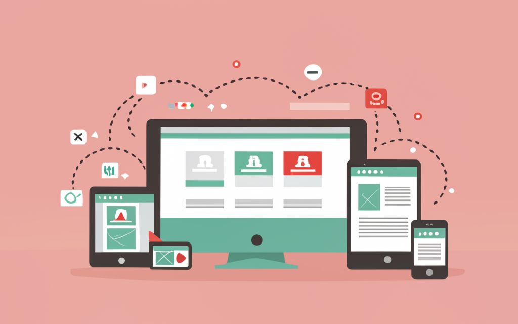
CSS media queries are a powerful tool that allow you to apply different styles based on the characteristics of the device or viewport. They enable you to create responsive designs that adapt to different screen sizes, resolutions, and device types (desktop, tablet, mobile, etc.).
Syntax
The basic syntax for a media query is as follows:
css
@media [media-type] ([media-feature-rule]) {

/* CSS rules go here */

}@mediais the at-rule that starts a media query.media-type(optional) specifies the type of media the styles should apply to, such asscreen,print, orall(default).media-feature-ruledefines the conditions or rules that must be met for the styles to apply. Common rules includemin-width,max-width,orientation, and others.
Common Use Cases
- Responsive Web Design
Media queries are essential for creating responsive websites that adapt to different screen sizes. Here’s an example of how to apply different styles based on the viewport width (see more on breakpoints below):
css
/* Styles for screens smaller than 600px (mobile devices) */

@media screen and (max-width: 599px) {

body {

font-size: 14px;

}

.container {

width: 100%;

}

}@media screen and (min-width: 600px) and (max-width: 899px) {
body {
font-size: 16px;
}
.container {
width: 80%;
}
}
@media screen and (min-width: 900px) {
body {
font-size: 18px;
}
.container {
width: 60%;
}
}
- Printing Styles
Media queries can be used to apply specific styles when a page is printed to paper:
css
/* Styles for printing */

@media print {

body {

font-size: 12pt;

color: black;

background-color: white;

}

.no-print {

display: none;

}

}- Orientation-specific Styles
You can target styles based on the device’s orientation (portrait or landscape) using the orientation media feature:
css
/* Styles for portrait orientation */

@media (orientation: portrait) {

.container {

flex-direction: column;

}

}@media (orientation: landscape) {
.container {
flex-direction: row;
}
}
Common CSS Breakpoints
When creating responsive designs with media queries, it’s essential to consider the screen sizes of popular devices and web browsers. By targeting specific breakpoints, you can ensure that your website or application displays correctly across a wide range of devices.
Desktop Browsers
For desktop browsers, the most common breakpoints are:
- 1920px: This breakpoint targets large desktop screens and high-resolution displays. It’s a good practice to start with a wide layout and scale down for smaller screens.
- 1366px: This breakpoint covers most modern desktop and laptop displays with a resolution of 1366×768 pixels or higher.
- 1024px: This breakpoint is suitable for older desktops and laptops with smaller screen resolutions.
css
/* Styles for large desktop screens */

@media screen and (min-width: 1920px) {

/* CSS rules */

}@media screen and (max-width: 1919px) and (min-width: 1367px) {
/* CSS rules */
}
@media screen and (max-width: 1366px) and (min-width: 1025px) {
/* CSS rules */
}
Tablets and Mobile Devices
For tablets and mobile devices, the most common breakpoints are:
- 768px: This breakpoint targets most tablets in landscape orientation and some smaller desktop screens.
- 600px: This breakpoint is a common choice for targeting smaller tablets and larger mobile devices in landscape orientation.
- 480px: This breakpoint is suitable for most smartphones in landscape orientation.
- 320px: This breakpoint covers most smartphones in portrait orientation, including older and lower-resolution devices.
css
/* Styles for tablets in landscape orientation */

@media screen and (max-width: 1024px) and (min-width: 769px) {

/* CSS rules */

}@media screen and (max-width: 768px) and (min-width: 601px) {
/* CSS rules */
}
@media screen and (max-width: 600px) and (min-width: 481px) {
/* CSS rules */
}
@media screen and (max-width: 480px) {
/* CSS rules */
}
It’s important to note that these breakpoints are general guidelines and may vary depending on your specific project requirements, target audience, and device usage patterns. It’s always a good practice to test your website or application on actual devices and make adjustments as needed.
Additionally, consider using responsive design techniques like fluid grids, flexible images, and media queries to create a seamless experience across different devices and screen sizes.
Best Practices
- Use relative units like
em,rem, orvw/vhfor better responsiveness. - Start with mobile-first or desktop-first approach based on your target audience.
- Combine media queries with CSS techniques like flexbox and grid for efficient layouts.
- Prefer
min-widthovermax-widthfor better future-proofing. - Test your media queries on various devices and screen sizes.
CSS media queries are a powerful tool that enable you to create responsive and adaptive designs. By understanding their syntax and use cases, you can create websites and applications that provide an optimal user experience across a wide range of devices and screen sizes.


